NFDI4Chem launched its new logo in the last quarter of 2021. The simple, clear, and recognisable graphic was designed to align with the key concepts of research data management in chemistry.
On November 10, a little over one year after the consortium’s Kick-Off, NFDI4Chem launched its new corporate identity. The original logo was composed of a flurry of hexagonal shapes tinged in light shades of blue. It was well-liked by the majority of the consortium members. However, due to its complexity and level of detail, it proved impractical for many digital applications. Therefore, NFDI4Chem commissioned the design of a new logo and corporate identity early in 2021. After gathering several offers, timespin, a company based in Jena, won the contract.
The new approach
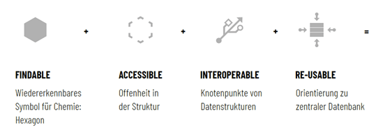
timespin’s carefully thought-out design manages to visually capture the mission of the initiative, namely to build an open and FAIR infrastructure for research data management in chemistry. The integration of several components, all inspired by the FAIR principles (see image below), resulted in a simple, clear, and recognisable graphic that aligns well with the key concepts of research data management in chemistry. The new logo resumes the hexagonal shape from the original logo. It picks up blue as the main color, but uses a bolder and more modern shade. In the style of chemical formulas, NFDI4Chem comes with a subscript “4” in the logo, which optionally carries the claim “enhance your data”. A set of colours, recommended font, and templates for prevalent applications complete the tools towards a coherent, visual identity of NFDI4Chem.
Colours and logo have also been replaced on the NFDI4Chem website. However, this is only a temporary fix. With the input from the NFDI4Chem Steering Committee, timespin is currently working towards a complete overhaul of the NFDI4Chem website. So, watch this space!